







TOUCH-SCREEN | 2022 - 2025
The Lotteries retail network comprises 3,900 outlets and 6,000 terminals across Australia. With much of the existing hardware reaching end-of-life and becoming increasingly difficult to support, a major program of work was initiated to introduce a new hardware solution and modernise the terminal software. I was responsible for the UX/UI redesign of the new terminal touch-screen experience, working closely with product and technology teams throughout a 2 year development and delivery phase. The new experience was designed to support both new and legacy hardware, providing a more modern, consistent and scalable retail platform.
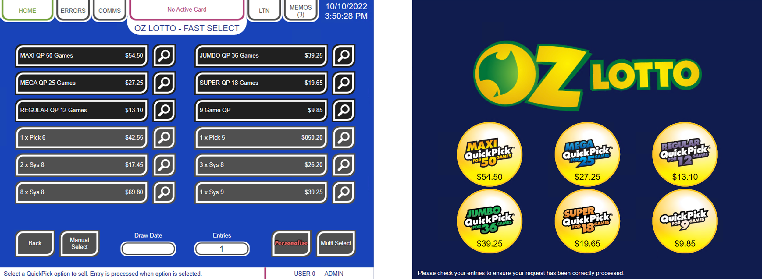
The retailer experience is made up of two separate terminal interfaces: the operator interface on the left and the customer interface on the right. Together, they support the selection of games, products and ticket options.
The existing UI (shown here) had been designed and developed more than 14 years earlier and had become increasingly difficult to use and maintain, creating a number of pain points for both retailers and customers.
During the discovery phase, I met with both retailers and customers. We performed qualitative and quantitative user research to identify a number of key issues, which were plaguing users on the old terminals.
One of these pain-points was the lack of a central 'cart' experience, where each and every sale item was treated as a separate transaction. This was causing unnecessary repetition and slow time-to-serve.
I developed low and high-fidelity clickable prototypes to test design hypotheses with both retailers and customers. One key area of exploration was the introduction of a cart-based UX, investigating how it could streamline the purchase process, reduce interaction time and give customers greater clarity and control over their selections.
I redesigned the selling experience from a single transaction per ticket to a single transaction per customer, allowing multiple ticket selections to be completed within one transaction.
Subsequent user testing demonstrated that the new approach reduced time-to-serve, enabling retailers to serve more customers during peak periods, particularly during major jackpot events.
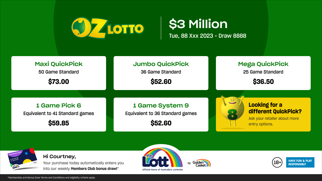
I refreshed the customer-facing UI to clearly mirror the key game selections being made by the operator, creating greater transparency and alignment throughout the purchase journey.
The experience also needed to accommodate variations in game rules and requirements across different Australian jurisdictions, which were carefully considered and incorporated into the design.
I worked as part of a large cross-functional team of 14 developers, 3 business analysts and 3 testers across multiple feature teams throughout a 2 year development and delivery phase.
The scale of the program required me to manage multiple streams of communication, maintain design consistency across teams and provide clear UX/UI direction and art direction to a large development team.
Although the customer interface does not currently support touch interaction, the experience was designed with future touch-screen capability in mind, providing a foundation to evolve the customer journey as the hardware and technology develop.
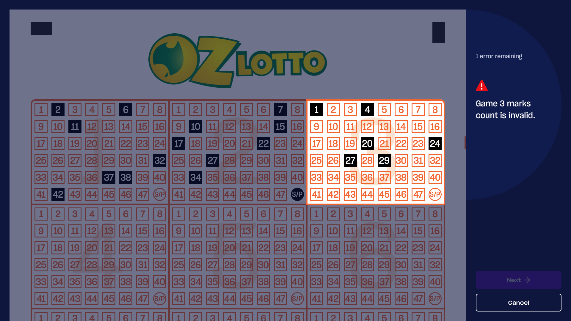
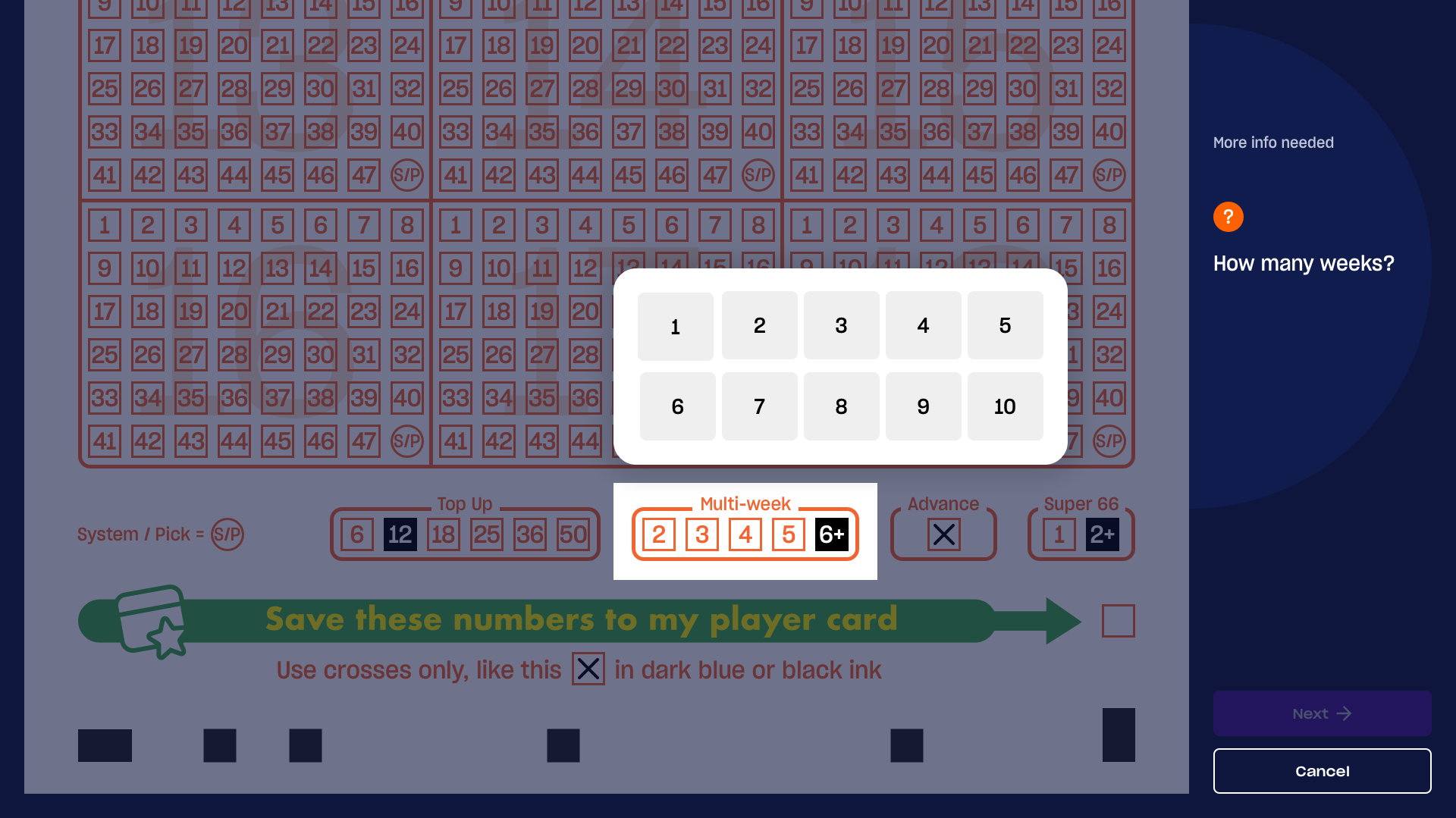
One feature that required significant attention was the coupon editor, which appears on both the operator and customer interfaces when a scanned coupon contains an error - for example, when too many or too few numbers have been selected.
I redesigned the experience to make errors clearer and corrections easier to complete. The new interface gave operators greater flexibility to make free-form edits, while providing clearer guidance around game rules and helping them explain required corrections to customers.
I worked closely with brand, legal and key stakeholders to ensure complex game logic, rules and brand requirements were accurately represented across the experience.
To maintain consistency and efficiency across multiple feature teams, I helped to establish and maintain a Figma-based design system, providing a single source of truth for UI components, patterns and visual standards.
The latest hardware package introduced a new ticket checker device, providing an opportunity to create a more engaging idle experience.
I designed and developed an eye-catching idle animation using CSS transitions, along with a set of dynamic result screens that provided clear visual feedback throughout the ticket-checking interaction.
A small but significant design opportunity I looked at was the optimisation of the printed ticket. By making minor refinements to typography and barcode sizing, I reduced the average ticket length by 15%.
This reduced paper consumption across the retail network, delivering a simple but measurable cost saving for the business.
Although I often worked remotely, regular team meet-ups and informal lunches helped build strong relationships, morale and team unity throughout the project.